Category:
Branding & Corporate Video
Client:
AiQube Labs
Year:
2024
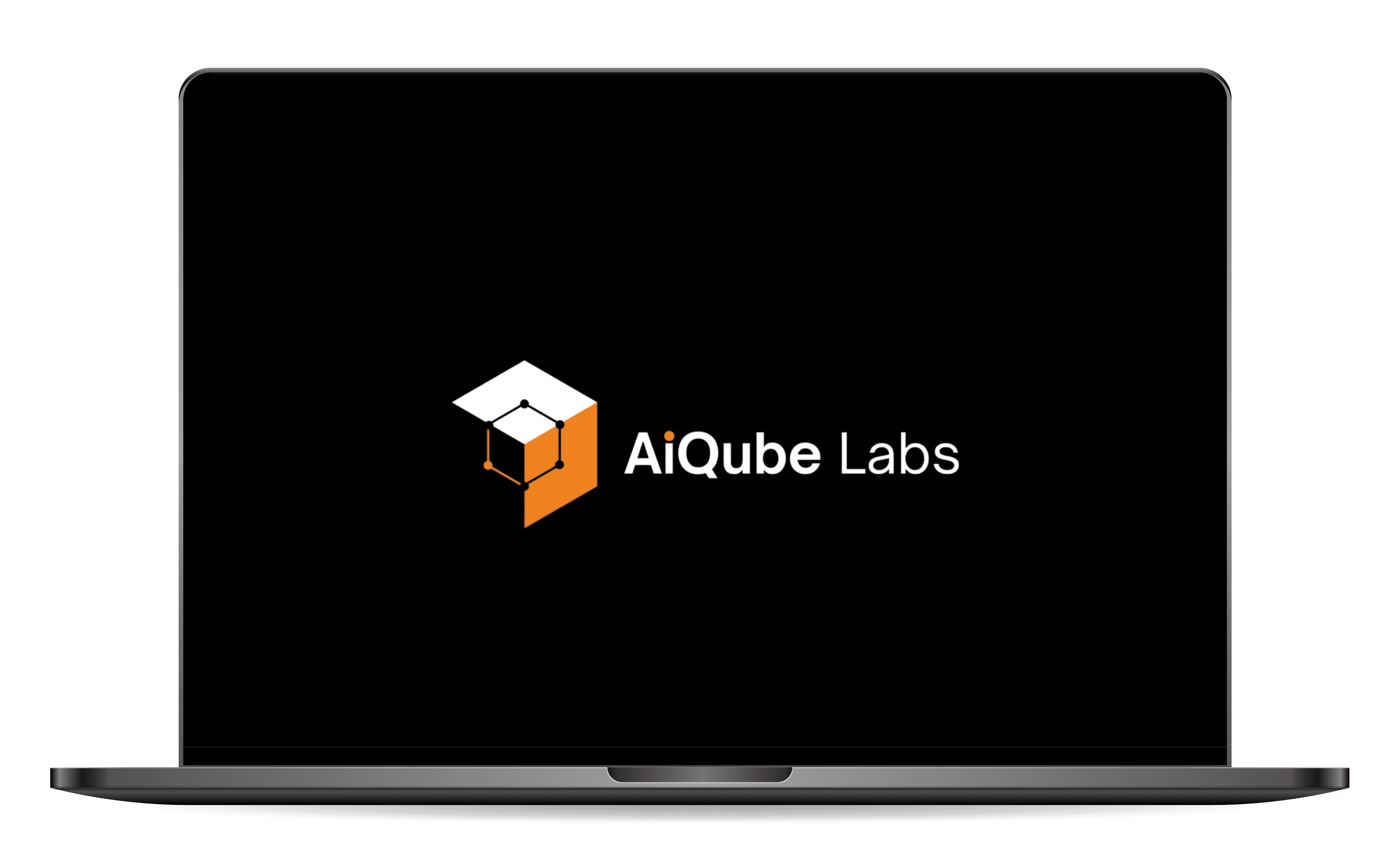
AiQube Labs faced the challenge of redefining its visual identity and positioning itself in the competitive tech market. The initial problem was that the brand used a logo generated by artificial intelligence, which prevented it from standing out and having its own identity. Additionally, it lacked a solid structure in terms of colors, typography, and storytelling, which weakened its market presence. Our goal was to create a unique and coherent visual identity that reflected AiQube Labs' core values: intelligence, advanced technology, and the development of products driving the next digital era.
(APPROACH)
The main challenge was developing a solid logo and visual identity. The new AiQube Labs logo symbolizes the fusion of technology and intelligence, represented by dots and lines evoking neural connections, fused with the shape of a cube. This geometric form communicates the creation of intelligent, well-developed products, reflecting the brand’s focus on advanced technological solutions. The slogan, “We are more than developers, we are architects of the next digital era,” reinforces this concept of innovation and technological leadership. The choice of orange is unusual in the tech sector, allowing us to differentiate ourselves in the market. This color conveys energy, creativity, and dynamism—key attributes that AiQube Labs wants to project. The modern and simple typography complements the design, adding a sense of technological clarity and precision. To consolidate this new identity, we created an animated corporate video using motion graphics with a retro and illustrative style. We used geometric shapes and dynamic animation to tell the brand’s story, which not only improved the aesthetics but also emotionally connected with the audience by projecting confidence and innovation.
(VISION & INNOVATION)
Our vision for AiQube Labs was to turn it into a distinctive tech brand capable of standing out both visually and conceptually in a highly competitive sector. Every design decision—from the creation of the logo to the selection of colors and the video narrative—was aimed at projecting a pioneering brand in the new digital era. The use of orange as the key color and the geometric visual structure communicate innovation in a fresh and memorable way. The corporate video, with its retro style and motion graphics, not only reinforced the visual identity but also acted as an educational and inspiring medium that showed the audience AiQube Labs’ ability to lead technological innovation.

(CHALLENGES)
The biggest challenge was transforming a weak and fragmented identity into a solid and distinctive brand. The logo generated by artificial intelligence did not reflect the brand’s values or essence, and its lack of visual structure created a disconnect with the audience. By defining a coherent logo, a color palette, and clear storytelling, we succeeded in creating an identity that projects innovation and leadership in the sector.
(ISSUES)
Initially, AiQube Labs had no corporate applications or a defined storytelling, which affected how it connected with its audience. The lack of visual cohesion made it difficult for the brand to project itself as a reliable one. However, by creating a strong narrative aligned with its technological vision and designing an animated video explaining its value proposition, we strengthened the emotional connection with its target audience.

(USER-CENTRIC DESIGN)
The design of AiQube Labs focused on creating a visual identity that was easily recognizable and emotionally connected to its users. By integrating geometric shapes and vibrant colors, we ensured that the brand projected confidence and innovation. The visual consistency extended to all touchpoints, from the website to corporate applications, reinforcing its positioning as a brand that drives the digital future.
(USER NEEDS)
Every action taken in the AiQube Labs project reflects our ability to transform and elevate the brand’s identity, adapting to the challenges of the tech market. They went from having an inconsistent identity to becoming a recognized and respected brand in their sector. The use of solid storytelling and innovative visual design allowed AiQube Labs to stand out as a leader in the development of intelligent tech solutions.
With this development, the transformation case of AiQube Labs highlights how creating a unique logo, well-defined storytelling, and the use of differentiating colors helped the brand position itself in the market.